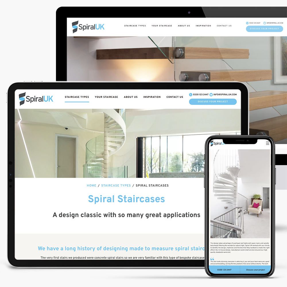
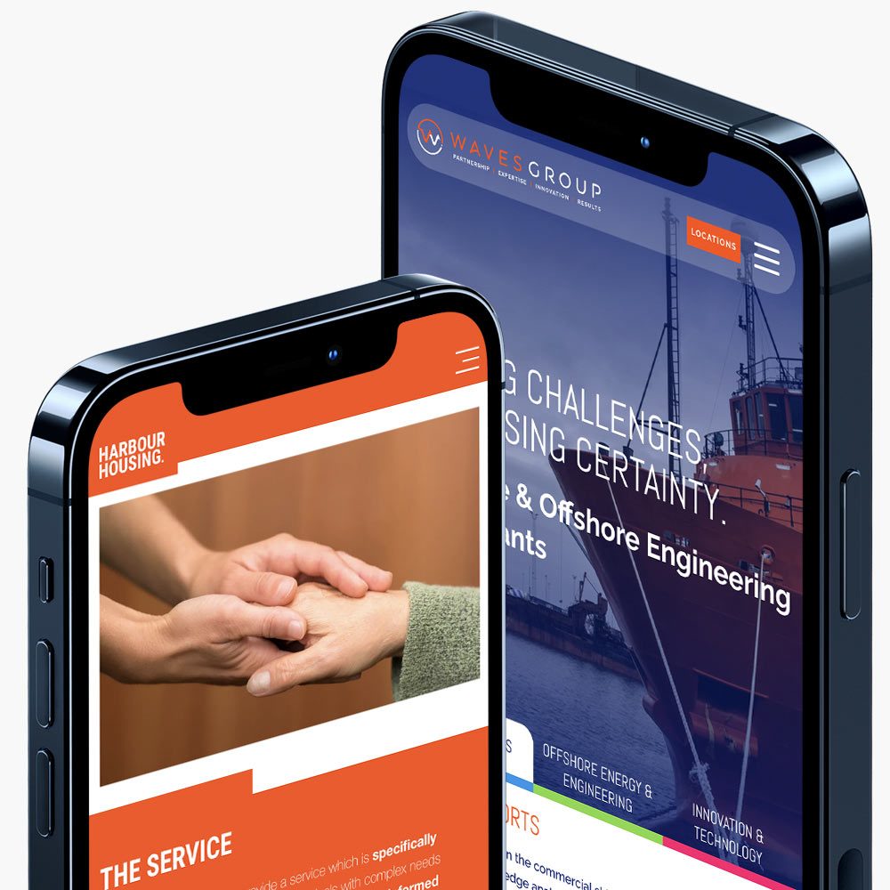
In the digital age, having a website that is easily accessible and user-friendly across various devices is crucial for businesses and individuals alike. This necessity has given rise to responsive website design (RWD), a website design and development approach aimed at creating sites that provide an optimal viewing experience on a wide range of devices, from desktop computers to mobile phones.
Over 54%
of traffic comes from mobile devices
Over 70%
of social media traffic comes from mobile devices
As technology advances, the importance of responsive design will only increase. With the rise of new devices, such as foldable smartphones and smartwatches, websites will need to adapt even further. Additionally, advancements in artificial intelligence and machine learning may lead to more personalized and dynamic responsive experiences, tailoring content based on user preferences and behaviors.
Moreover, the growing emphasis on user experience (UX) and accessibility will drive further innovations in responsive design. Websites will not only need to be visually appealing across devices but also inclusive for users with disabilities, ensuring that everyone can access content seamlessly.
Here are some frequently asked questions (FAQs) about Responsive Web Design…
Responsive website design is no longer just a trend; it is a necessity in the modern digital landscape. By ensuring that websites are user-friendly, accessible, and optimised for a variety of devices, businesses in Cornwall can improve user engagement, enhance SEO, and reduce maintenance costs. While there are challenges involved in creating a responsive site, following best practices and utilising available tools can lead to successful outcomes. As technology continues to evolve, embracing responsive design will ensure that your website remains relevant and effective in meeting the needs of users across all platforms.
What is responsive website design?
Responsive website design is an approach to web development that allows a website to adapt its layout and content to fit different screen sizes and devices, providing an optimal viewing experience on desktops, tablets, and smartphones.
Why is responsive design important?
Responsive design is important because it ensures a consistent and user-friendly experience across various devices. With the increasing use of mobile devices for browsing, a responsive design can enhance user engagement, reduce bounce rates, and improve search engine rankings.
How does responsive design work?
Responsive design works through fluid grids, flexible images, and media queries. Fluid grids use percentage-based widths, flexible images scale within their containers, and media queries apply different styles based on the device’s characteristics, such as screen size.
What are the benefits of responsive design?
The benefits include:

